Manage Custom Assessment Forms
Objective: Gain an understanding of how to Add, Edit, Configure, and Delete custom Assessment Forms.
All custom assessment forms are managed through the 'Admin' module within the 'Assessment' category. This article outlines all features involved in creating and managing custom assessment forms.
Assessment Form Workflow
The workflow of managing custom forms is shown in the diagram below.
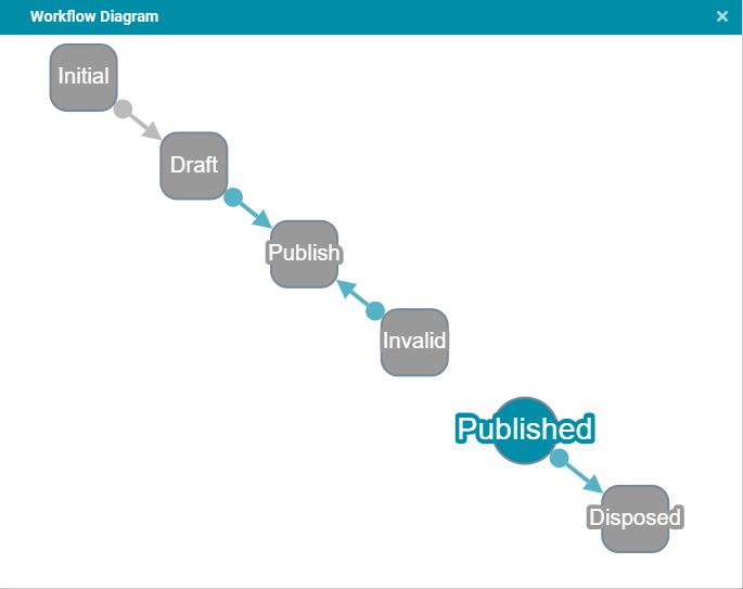
Each custom form status in the workflow is described below.
-
Initial: The forms that have been created in the system before the workflow was established will be in an initial state. While a form is in this stage it will not be available for linking to a project or be searchable in the advanced search. If a form is in an initial stage and needs to be published, change the status to 'Draft' first then publish.
-
Draft: When a form is first created it will be in a draft stage. Users can edit the form while it is in the draft stage. While a form is in this status it will not be available for linking to a project or be available in the advanced search.
-
Published: Once a form is published, it is ready for use in assessments and is available for linking to a project and also available in the advanced search.
-
Invalid: A form will become invalid if users attempt to publish it but there is an error and the publishing fails.
-
Disposed: A form can be disposed of (taken out of the system) only if it is not linked to a project.
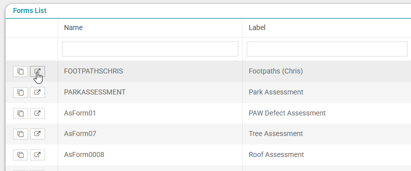
View Assessment Forms List
To view existing assessment forms, select 'Admin' from the primary navigation drop-down and then 'Assessment' from the secondary drop-down menu.
The user will be taken to the Forms List section and the following screen will display.
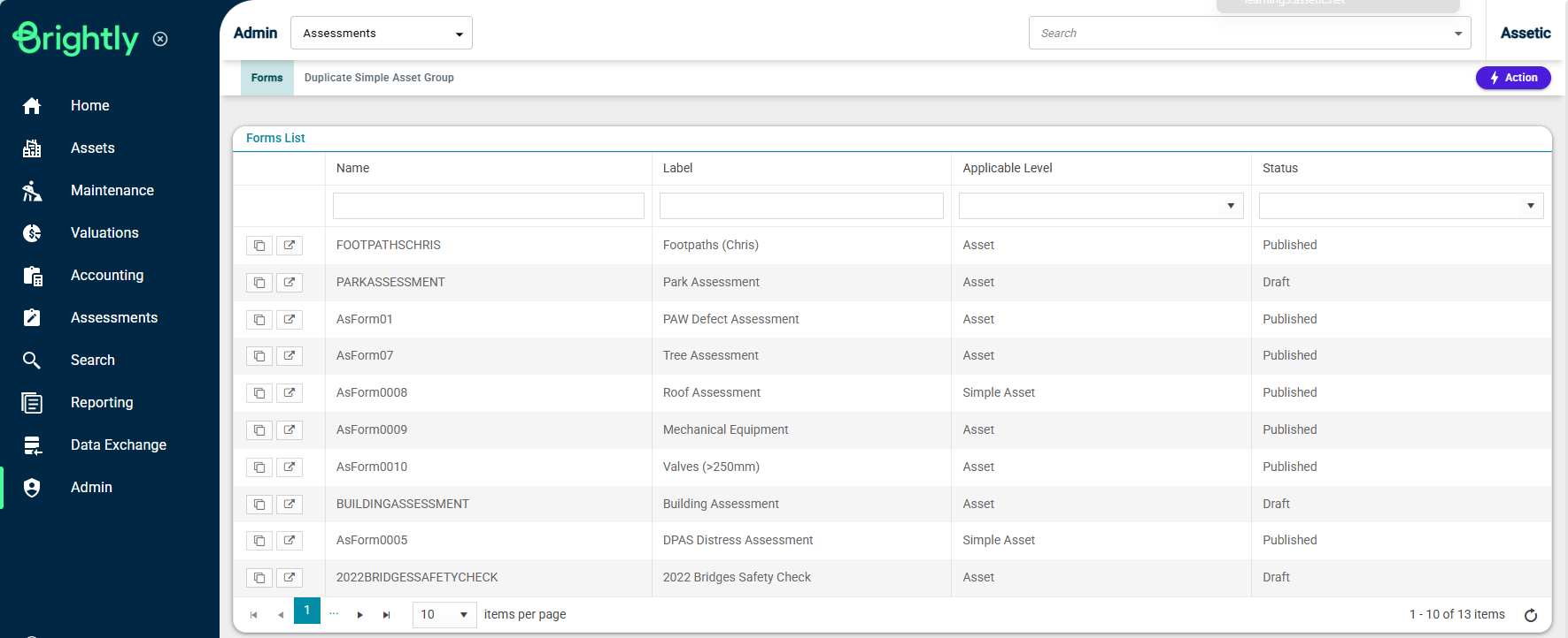
All existing assessment forms in the system can be seen here with key information.
The status of the form is shown in the rightmost column and represents the current state within the workflow process.
To view the configuration of any existing forms within the list, select the form row entry from within the list.
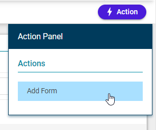
Add A New Assessment Form
To create a new form select the 'Action' menu on the top right and choose 'Add Form' from the Action Panel.
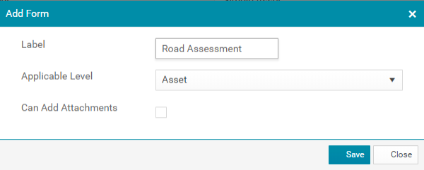
The following window will display.
-
Label: Type the assessment form name here.
-
Applicable Level: From the drop-down list, select the asset level in the asset hierarchy system that this form is applied to. The current user has the ability to select from the following options: Asset or Work Order.
-
Can Add Attachments: If it is required for any documents or photos to be attached as part of the assessment, check the box 'Can Add Attachments'.
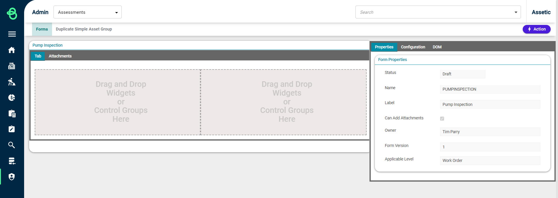
Once all relevant information has been input, select 'Save' and the following screen will appear.
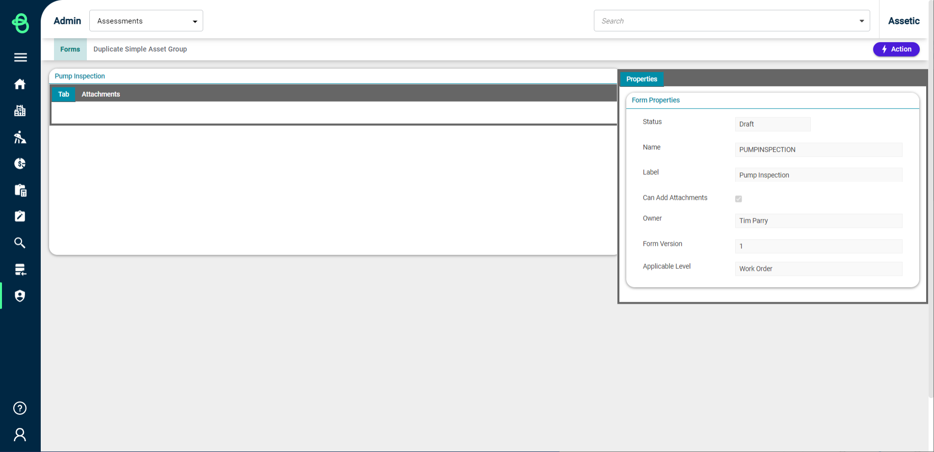
Form details will populate within the 'Form Properties' box on the right side of the screen.
-
Status: This shows the status of the form, which is in 'Draft' status until the user publishes the form.
-
Name: The name identifier of the form is system populated and cannot be edited by the user.
-
Label, Can Add Attachments, Applicable Level: As described above, these are populated by the user during the 'Add Form' prompt.
-
Form Owner: The creator of the form. Only the form owner can edit a form however, ownership of a form can be changed if required.
-
Version: Form version (currently an implemented feature).
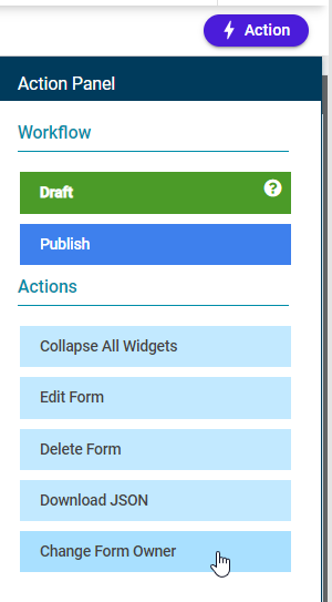
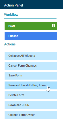
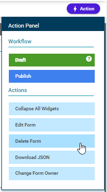
NOTE All features in managing a custom form are available in the Action Panel. Once a form has been opened, open the 'Actions' menu on the top right corner and select the appropriate menu action for managing the form.
Edit An Assessment Form
To configure a newly created form, or to edit an existing one, the form needs to first be in edit mode. A form can only be edited by the form owner.
Change Form Ownership
Form ownership can be changed if required by selecting 'Change Form Owner' button within the Action panel.
The following window will appear.
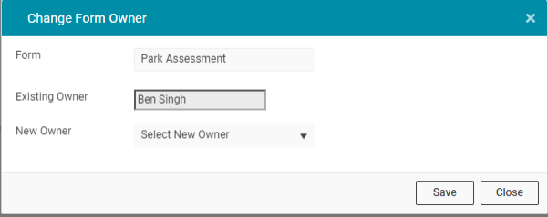
Select the name of the New Owner and choose 'Save' to finalise.
Edit Form Configuration
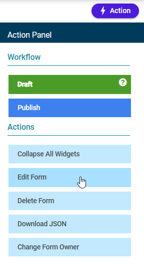
To transition a form into edit mode, choose the form requiring modifications via the Forms List, and then select 'Edit Form' from the Actions menu.
The following screen will appear.
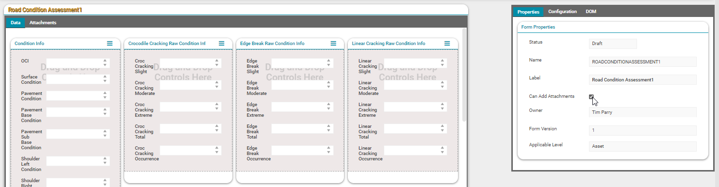
Here, a user can configure and customise the assessment form. The configuration screen is split into two sections.
The left section of the screen is the form itself. The top left corner of this section displays the Label of the form, and any configurations applied to the form by the user will appear under the 'Tab' header. If attachments are enabled for the assessment form an additional 'Attachments' tab will appear within the header.
The right section of the screen displays all of the available tools used in the form configuration process.
It is also possible to modify the 'Label' field and to enable 'Can Add Attachments' while form editing is in progress.
NOTE Currently a form can consist of only one tab for creating assessment fields and another tab for adding attachments if required.
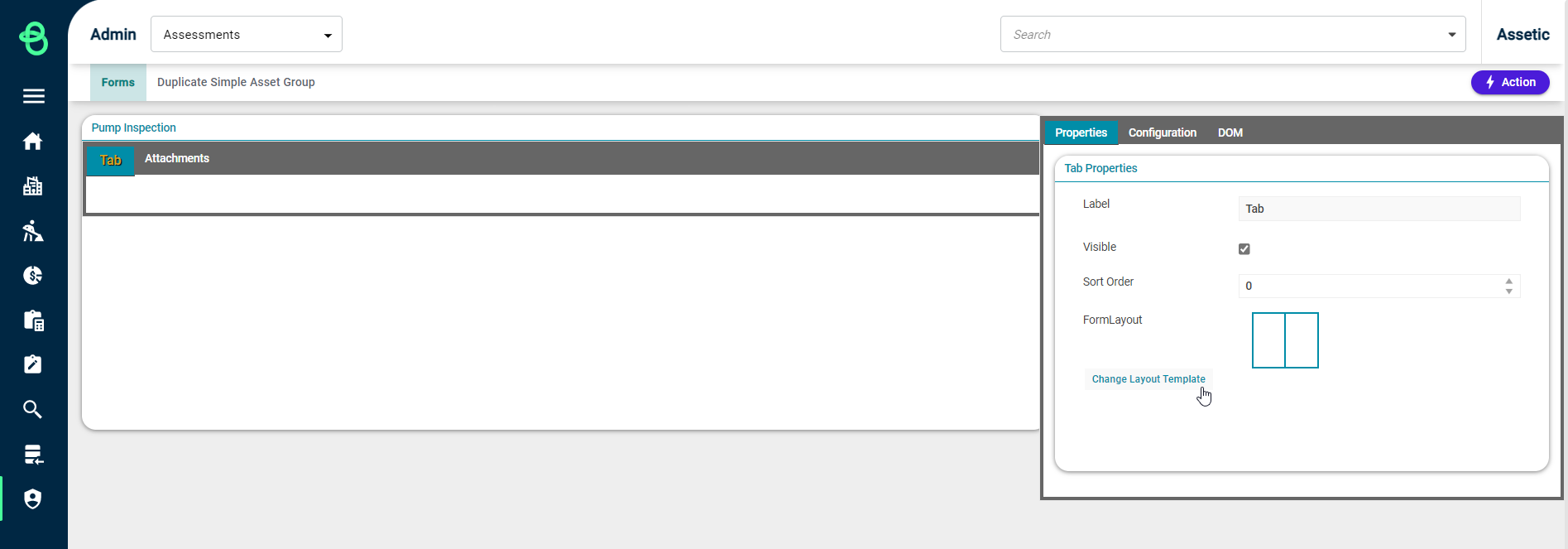
Change Form Layout
A range of 'Form Layout' options are available for compartmentalising a form into different distinct sections. After selecting the 'Tab' header, use the 'Change Layout Template' button within the Properties window to access the available templates.
The following popup screen will appear.
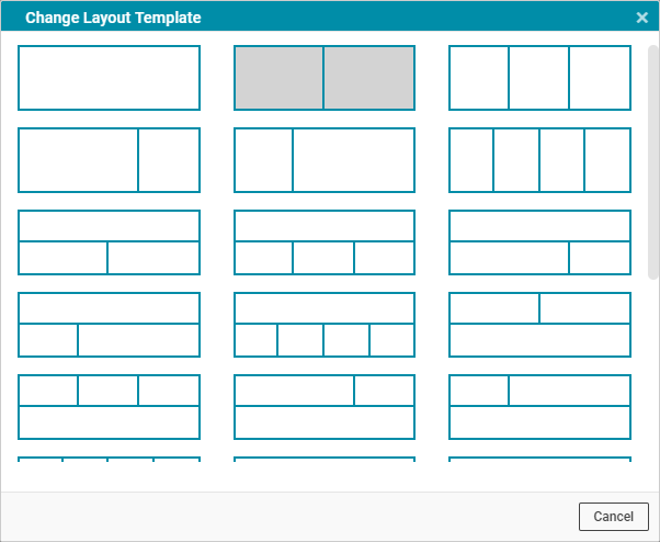
A range of different layouts for the assessment form can be chosen here. Select the most appropriate template layout for the form by selecting the required template image.
The form layout will then be visually changed to match the preferred template.
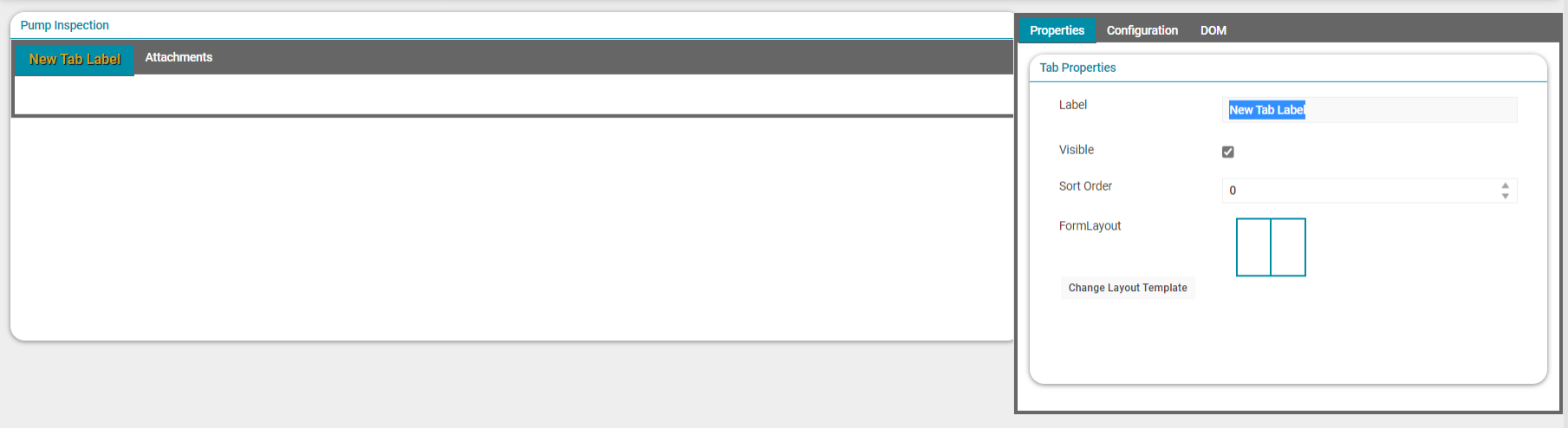
To save layout changes, select 'Save Form' through the Action Panel menu.
Edit Tab Label
The 'Tab' label can be changed to a user-defined name.
First, select the 'Tab' header and then under 'Tab Properties' a meaningful label can be applied if required by modifying the Label text box.
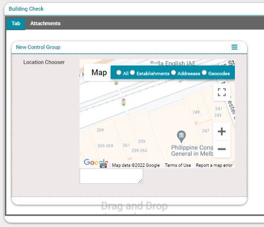
Add Group Boxes (Control Groups)
Before adding assessment fields to a form, the user needs to add 'Control Groups' to each section.
'Control Groups' allow the grouping of assessment fields named 'Controls' according to user requirements.
To add control groups to a form select the 'Configuration' tab and then select 'Control Groups' under that. Drag and drop the 'New Control Group' box to a section of the form.
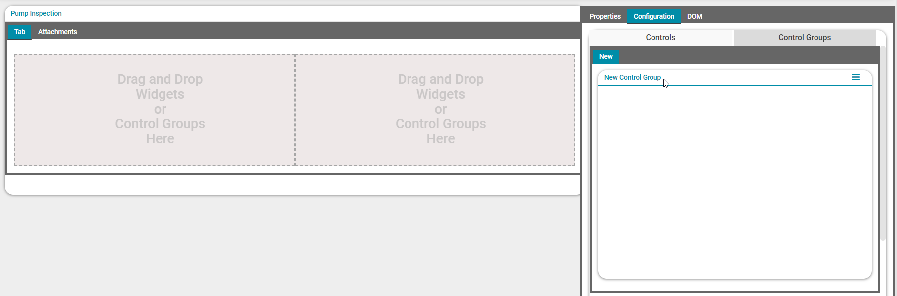
Any number of Control Groups can be added to one section of the form as required. The following screen shows a form after adding group boxes to each section.
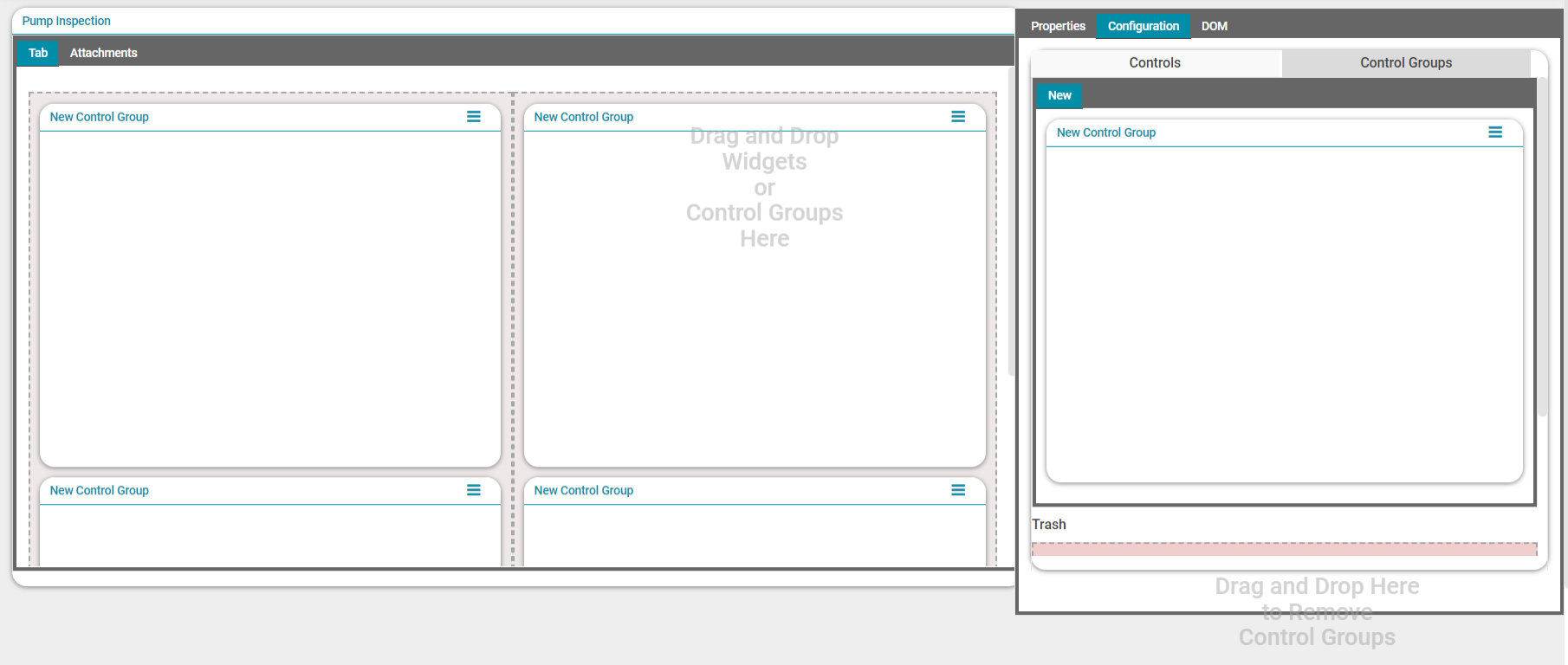
Group Box Labelling
To modify the label for a Control Group box, select the group box heading 'New Control Group'. Within the Properties tab in the 'Control Group Properties' section, type the new name for the Control Group in the textbox that appears next to the field 'Title'.

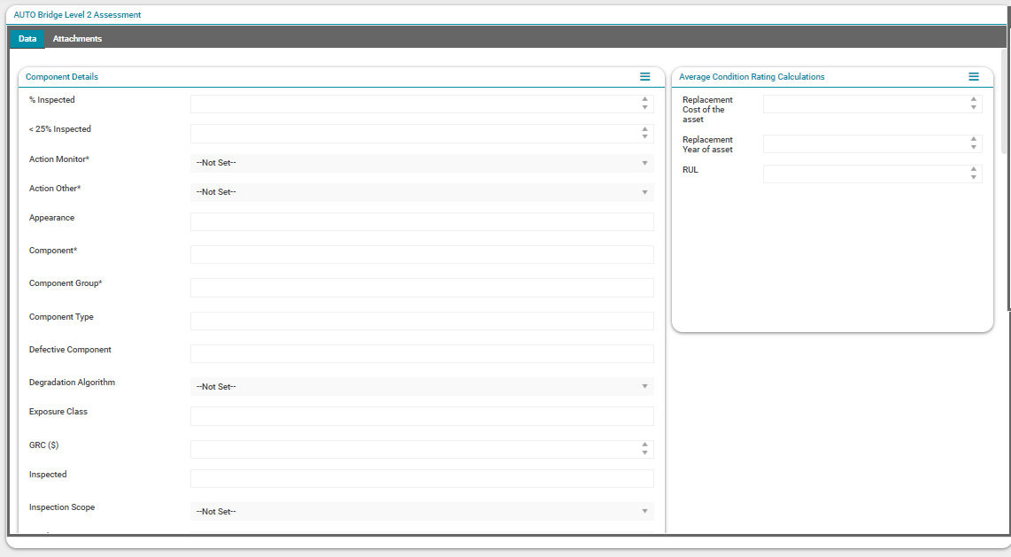
Add Assessment Fields (Controls)
While editing a form, select the 'Tab' header and then select the 'Configuration' tab in the section on the right side of the screen. Under 'Configuration' select the 'Controls' tabs to begin the process of configuring the assessment form fields.
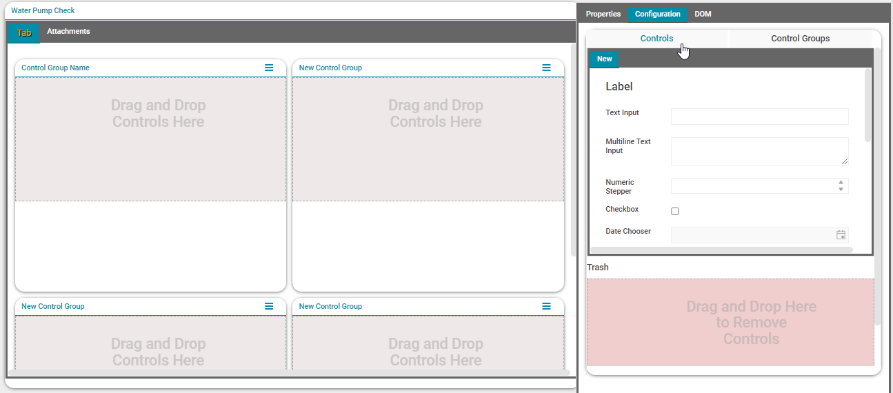
All available field controls are shown within the 'Controls' tab.
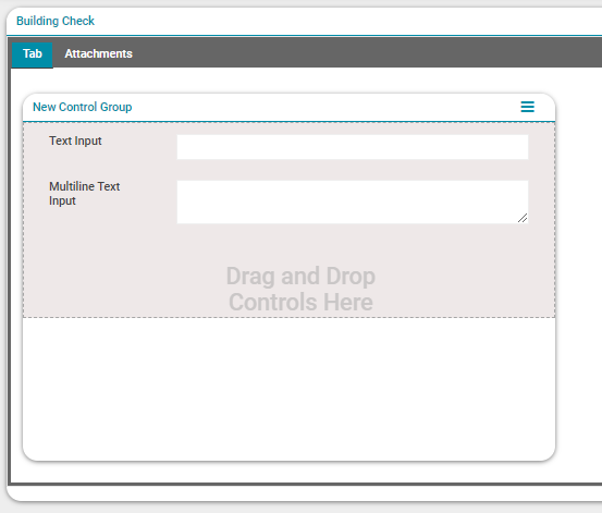
To add fields to the form, drag the required controls from the Controls tab and drop them into the relevant group box.
Once a field control has been dragged and dropped on to the form it can then be customised to meet the requirements of the assessment. This is done by selecting the field in the 'Tab' view to display its configurable 'Control Properties'.
Each field type will have the below common properties available regardless of the field type.
-
Label: Type the field name in the field that appears under the label. The maximum number of characters allowed is 100.
-
Help String: Can be used to provide an explanation of the field. Note that due to interface limitations, the help strings in completed Forms can only be viewed on the desktop - on mobile devices, the help strings will not be shown.
-
Visible: Once a field is added to the form by default it is visible. However, a field can be hidden by unchecking the checkbox.
-
Required: When the 'Required' box is checked against a field, it makes that field a mandatory field and an asterisk appears next to the field. An Assessment cannot be completed without providing input for all mandatory fields. When configuring fields in an assessment form, by default the 'Required' box is unchecked for every field. Check the box if a field needs to be a mandatory field.
-
Read Only: By checking the read-only box, a field can be made read-only. For example, a calculated field can be made a read-only field.
The currently available field controls are detailed below, including their type-specific properties.
Control: Text Input & Multiline Text Input
A text field to allow free-typed text in either single line or multiline format, up to a specified maximum length.
-
Maximum Text Length: Define the maximum number of characters that can be included in a field.
Control: Numeric Stepper
-
A field to capture a numeric value in a specified format. The value can either be entered in manually or incremented utilising the arrows on the right side of the field.
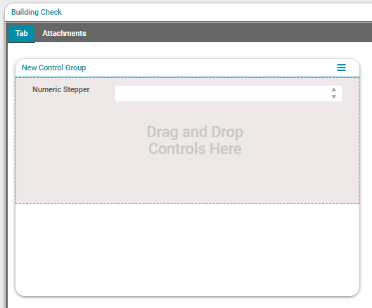
-
Numeric Minimum: Defines minimum value that can be entered to a numeric field.
-
Numeric Maximum: Defines maximum value that can be entered into a numeric field.
-
Step: Incremental value that can be applied to the field. Instead of manually typing in the values, assessors can use arrow keys to incrementally increase or decrease the value of the field.
-
Number format: Define the format of the numeric field. If the field should be an integer put n0. If it needs decimals, use n1, n2 etc. for one decimal place or two decimal places respectively. If the field values should be a currency, use 'C' instead of 'N'
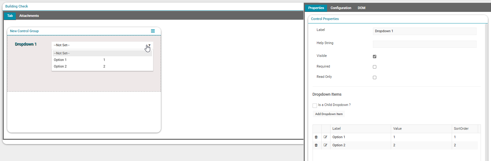
Control: Dropdown
A dropdown field populated with predefined items, each with an associated value and sort order.
-
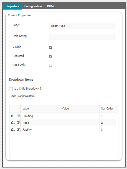
Dropdown Items: Create predefined values for the dropdown menu using the 'Add Dropdown Item' button. Each dropdown item can be defined with a text Label, a Value, and SortOrder number if a specific dropdown order is required. The Value data can be utilised in Advanced Search profiles. Individual dropdown items must be saved with the checkmark before the next item is added.
-
Child Dropdowns: Hierarchical dropdowns can be created using the 'Is a Child Dropdown?' checkbox. Additional details on how to build hierarchical dropdowns can be found later in this article.
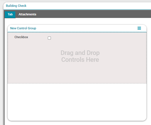
Control: Checkbox
A checkbox control that can be checked during an assessment, resulting in the value 'True' if checked, or 'False' if unchecked.
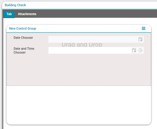
Control: Date Chooser, Date and Time Chooser
-
These are standard date/time chooser controls to allow the selection of a date value, or a date plus time value, using a calendar selection tool.
Control: Location Chooser
Location Chooser allows the user to select the location of the assessment using 'Google Maps'. A pin can be dropped on the location and it will return the address of the selected location.
Example Completed Assessment Form
NOTE Fields with asterisk mark (*) against them are mandatory fields that the assessor must populate when carrying out an assessment.
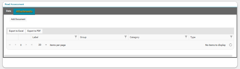
Enabling Attachments
A custom form can be configured so that attachments, such as documents or photos, can be added while performing assessments. Attachments can be enabled when creating the form, or any time while configuring the form, prior to moving the form to the Published status.
To enable the Attachments tab for a form, first select the form name in the header of the form window. Then, under the 'Properties' tab and in the 'Form Properties' window, tick the checkbox 'Can Add Attachments' to enable the Attachments tab for the form.
Then select 'Save and Finish Editing Form' through the Actions menu to display the now enabled Attachments tab on the form.
Configuring Hierarchical Dropdowns
Assessment Forms can be built to include hierarchical dropdown fields, where the values available to be selected in a dropdown that has been designated as a 'Child' are dependant on the selections made in another dropdown that has been designated as the 'Parent'.
Configuring a hierarchical dropdown relationship requires two dropdown controls, each with its own preconfigured dropdown items. In the below example, two dropdown controls have been configured and populated with Dropdown Items that are to be used in a hierarchical relationship.
Parent
Child
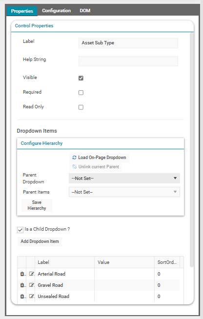
To create a hierarchical relationship between two dropdown controls a dropdown must first be designated as the 'Child' dropdown control within the hierarchy.
Select a dropdown control, and within Properties check as active the "Is a Child Dropdown?' checkbox.
A new section 'Configure Hierarchy' will expand to allow users to designate a 'Parent' for the relationship.
-
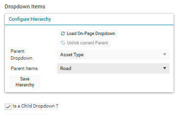
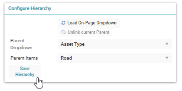
Parent Dropdown: Select the dropdown control to be designated as the 'Parent' from all available dropdown controls.
-
Parent Items: Select an item from the chosen 'Parent' dropdown control, which will be the dependent value for any items nominated from the 'Child' dropdown control.
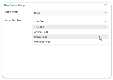
Once a user has configured the 'Parent' dependencies, any 'Child' items that are dependant on the chosen 'Parent Items' value can be chosen by clicking on the item to highlight the item. In the example below, the items 'Arterial Road' and 'Gravel Road' from the 'Child' control have been highlighted to indicate they are dependent on the item 'Road' from the 'Parent' control.
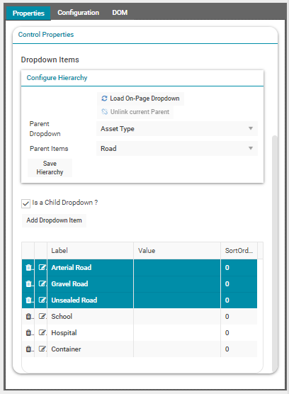
Once all of the required items have been selected, select the 'Save Hierarchy' button within the 'Configure Hierarchy' section to save the hierarchical relationship.
Repeat this process for any additional relationships, by changing the value in the 'Parent Items' dropdown, highlighting the relevant 'Child' values, and saving the relationship using the 'Save Hierarchy' button.
When all hierarchical dropdown relationships have been configured, select 'Save and Finish Editing Form' from the Action Panel.
The dropdown hierarchy configuration is then finalised and the nominated 'Child' dropdown items are only available when a designated 'Parent' value has been selected in the 'Parent Dropdown' control.
The finalized 'Child' dropdown can then be used as a 'Parent' of another dropdown following the same process, allowing users to build multiple tiers of hierarchical dropdowns.
Clone An Assessment Form
To create a clone of an existing Form, users can click on the Clone Form button.
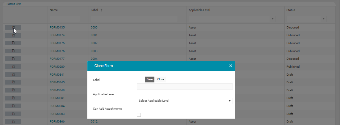
Users can choose a Label for the new Form, and change the Applicable Level (Asset or Work Order) if required.
Alternatively, an assessment form can be cloned using the Assetic REST API framework.
Additional information regarding integration using the Assetic API framework can be found within the Assetic REST API Introduction subsection.
The complete list of REST endpoints exposed by the Assetic Integration API can be obtained by logging into Brightly Assetic and then appending "/apidocs" to the end of the environment URL (i.e. https://your_org.assetic.net/apidocs)
Open in New Tab
To preserve any applied list filtering when opening Assessment Forms, the ‘open in new tab’ button can be used.
Delete An Assessment Form
A custom form can be deleted from the system only by the user who created the form and only when it is in the Draft status.
To delete an existing custom form, first load the form.
Then, from the Actions menu, select 'Delete Form'.
When the delete button is selected, a confirmation dialogue will appear, and then a status message will appear in the bottom right of the screen to signify the form has been successfully removed.